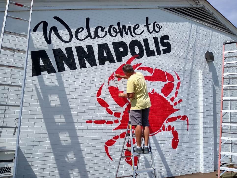
Incredible architectural murals use bold colors and shapes.
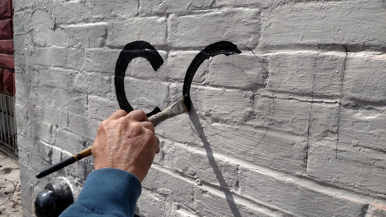
We traveled to Pittsburgh to paint these architectural murals for Whole Foods Market. To build them, we apply the different colors in layers, with a different pounce pattern for each color. Honestly, we love this style of mural painting. Color and shape are primary, and the reduced detailing also allows for better use of color to create striking contrasts. As a result, bold colors and shapes make this style of mural painting so much better-looking than many of the corporate mural designs that most designers propose today.
Good designers understand the artist’s tools.
Hopefully, we will see a return to these more traditional styles of lettering. Moreover, to properly design anything for a mural, it is essential to understand the basics of the process. In fact, designs will always be better when the designer understands the strengths and limitations of the process.
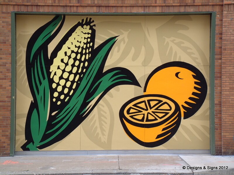
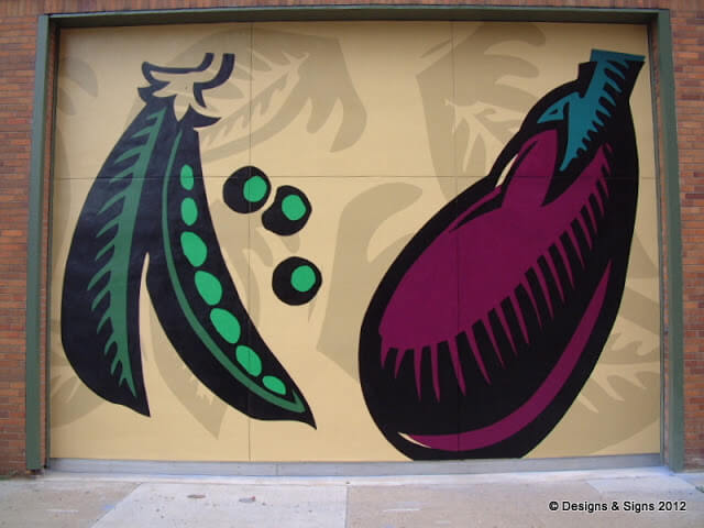
Shape, Color & Contrast – Architectural Murals.
Designs & Signs has installed many painted murals for Whole Foods Market. First, our painters applied the fruits and vegetables to the garage doors with pounce patterns. Then they painted the shapes by hand, building the colors in layers. Indeed, architectural murals require patience and planning. However, we love painting murals like this. Also, when designers approach their craft with a deeper understanding of the media and substrate, the planning and painting are easy and fun!
Contact Designs & Signs
The quickest way to get started on your project is to send us an email.
We can also be reached by phone at (410) 798-5115.